Content Creation Basics
Content, content, content. It’s all about the content. Good content, appealing content, well-presented content, consistently-presented content.
The website has a new platform and a new look and feel. A predominantly text-based site is now very graphically oriented. A different design requires a different approach to creating content so that the site doesn’t revert to being text-based.
This guide covers the general principles that apply to all content. Separate sections deal with specific content types, but they all use this section as a reference point.
Another change in the new site is that responsibility for creating dynamic content is delegated to the volunteer teams. This enables us to keep the site is kept up-to-date by removing bottlenecks in the publising cycle, but it is important that all content creators work to a common set of rules, so that content is presented consistently.
Print versus Online Media
Users read online content in a completely different way to print media. Let’s take the Historian as an example. The content is laid out on pages that are A4, in a two-column format. Users read down the first column until they reach the page end then flick their eyes to the top of the second column and read vertically again. When they reach the end they flick their eyes to the top of the opposite page and repeat the process. Then they turn the page and start over. They alternate between vertical and horizontal actions and they do it easily because the physical limitations of the page guide them..
Conversely, online media has no physical vertical boundary. You can scroll the page infinitely and easily but horizontal scrolling is anathema.
Width Matters
It’s more difficult to read content that requires lots of eyes or head movement. Widescreen monitors would require a lot of head swivelling if we used the full width. For this reason, online pages that feature a lot of text are usually “boxed.” just like this document is if you’re reading it online. This creates the hard horizontal borders we need to read comfortably. The consequence of boxing content is that pages become longer.
Waypoints
Printed media has waypoints – easily locatable positions within the text to which we can move quickly, such as top/bottom of the page, top/bottom of the column, next/previous page. We use these markers to swiftly move around the content. Online content is one continuous single-column page, so we don’t have the same waypoints to locate ourselves on the page. We need to provide alternatives.
Skim-Reading
Online users are far more likely to skim read, looking for interesting sections, and their attention span is limited. It is also easy for them to abandon a page – the browser back button is their friend and our enemy!
All of these factors mean that we have to write differently for online consumption.
People are not the only readers of our pages. Internet search engines will discover and analyse our content before indexing it so that it may be found easily by users too. There are techniques we can use to make our content more interesting to them too. As it happens, those techniques will also make our content more attractive to people, so it’s a win-win situation.
Modern website designs are founded on the principle of Micro Content. Paradoxically as broadband speeds have improved and page load speeds have dropped, users have become more inclined to click away from a page that does not quickly satisfy their needs, Click-away times are dropping all the time. We need to engage users and keep them engaged, especially at the top of our content tree – the pages where users alight first.
Microcontent helps us achieve this by slashing the number of words on a page. Graphics are used to signpost users to sections. Words are kept to the minimum with no repetition and simple language. White space abounds. The idea is that a user can absorb the intent of a page in under 7 seconds
Drive down deeper into the site and the content becomes increasingly “encyclopaedic” – large tracts of text become the norm.
These guides are a good example. They cover complex topics which would overwhelm a reader if presented as a continuous page. Complex topics need to be broken down so that they can be consumed in bite-sized chunks. The accordions we use here are a great way of doing that, allowing a content creator to absorb the intent of a page quickly and jump to a specific section without excessive scrolling.
Accordions are an advanced topic. You will need a supeuser/site admin’s help to set them up, although once that’s done, editing the content is relatively straightforward
When constructing content, break it up into sections and subsections by using Heading Styles
Heading 1
Heading 2
Heading 3
Heading 4
And for content, we use normal or paragraph style.
Visually these heading styles look differentto the eye, but they are significant from a system perspective too. Using the predefined heading styles causes hidden tags to be applied to them that act as a magnet for search engines. And, of course, they make it easier for a person to skim content looking for the content they need, which reduces abandonment rates. Because the use of heading styles is so important, we have disabled the ability for you to change the font size.
Bold is not the way to create headings but that doesn’t mean it has no place.
Bold is used to emphasise words or phrases in a sentence but it is only a visual cue for a reader. Search engines are blind to it. So if you want to make a phrase stand out, use bold.
Here are the rules:
- Use italics when you need to de-emphasise some text to make a relevant but lesser point without detracting from the main topic. See how it works?
- Use bold as the first level of emphasis to grab a user’s attention as they are reading or skimming.
- Use bold and italics in combination for a further level of emphasis
- Use bold and UPPERCASE to go the next level
- NEVER use underscore. Many older sites use underscore to indicate thet the words are linked to another page. Ours doesn’t, but let’s not create any confusion.
Coloured text is not the way to create headings.
In fact, coloured text must not be used under any circumstance because of usability and accessibility reasons.
Red is particularly troublesome. For people with visual impairment such as cataracts, red text can be difficult to read. In some forms of colour blindness, red text may be indistinguishable from black and, in some cases, may appear to have less emphasis than black text. And, as with bold, search engines place no priority on coloured text.
Images make content more appealing to people. A picture equals a thousand words.
And if images are provided with Alt-text they become attractive to search engines too, which boosts our SEO rankings. Alt-text is an alternative description for an image with the original purpose of describing the image to visually impaired people (their screen reader will find it), but without it, search engines would also be blind to what an image means.
Alt-text can be applied to an image during or after the process of adding it to the media library. The description should be succinct and avoid unnecessary fluff. It should NOT start with phrases such as “An image of / picture of …” because screen readers will identify it as an image automatically.
Featured Image
Most of the content types that we use have a concept called a Featured Image. As the name implies this is a special, one-off image, It’s special status means that it is called upon by various functions through the site to form the headline image. Featured Images are really important to showcase our content and must always be used. unless an individual guide says otherwise.
Size Matters
Images must be of the exact size required for the content type. For example, events images must be 300 x 300 px including shading. The detailed instructions for each content type will specify the required size. If an image is not the correct size.
- Too large and the system has to resize it during page load to make it fit the screen, which will slow down page response times.
- Too small and not only does it have to resized but the displayed version is likely to be grainy / poor quality .
Icons are not so relevant to dynamic content but are more important on high-level static pages. They are used extensively on throughout the website to provide visual clues about the purpose of a section of text. For examples, see the Where we are page.
If youebelieve your content may benefit from icons you’ll need to contact a site admin.
Long sentences with comma-separated lists are difficult to scan. Bulleted/numbered lists overcome this and also draw the attention of somone who is skim-reading, causing them to pasue/slowdown – which is what we want.
Bulleted/numbers lists are also known as unordered and ordered lists respectively and these titles help understand how to use them correctly and consistently.
- Bulleted/unordered lists are used to list items for which the order is unimportant or irrelevant
- Numbered/ordered lists are used:
- When the there is a sequence in which a series steps must be taken
- To rank the listed items
When you create a hyperlink to another piece of content please do NOT apply any styling to the words e.g. bold, italics, underline. Bold and italics are reservered for emphasising normal text and underscrores must never be used.
The site will take care of link styling in the frontend, using the parameters that have been set for the site. It is bad practice to add hyperlinks to headings.
When a hyperlink refers to an external site, including the shop site, make sure to adjust the settings to make the link open in a new tab. We want to refer users to other sources of information but we don’t want to lose them from our site.
Plain and Engaging English
However we may view it, genealogy is a dry enough subject without turning it into an academic treatise. We want to engage and hold our readers’ attention, A lot of our content is encyclopaedic but we can still make it engaging.
Avoid repetition
Say it once and say it well
Be succinct
Don’t use fifty words when ten will do. Online readers will become bored and move on
Use short paragraphs and sentences
There is no definitive “good” length for a paragraph or sentence but because people are inclined to skim-read, long constructions will only encourage them to move on. This guidance is relevant:
https://owl.purdue.edu/owl/general_writing/academic_writing/paragraphs_and_paragraphing/index.html
In particular:
You should start a new paragraph:
- When your readers need a pause. Breaks between paragraphs function as a short “break” for your readers—adding these in will help your writing be more readable. You would create a break if the paragraph becomes too long or the material is complex.
If we provide long tracts of text then our readers will need a pause
Microsoft Word / Google Docs
If you are familiar with Word / Google Docs, you can use them to draft content and then copy and paste it into the online editor. (Images will need to handled separately because they cannot be pasted in.) If you create content offline you must still comply with the requirements of the Content Creation Basics section. In particular, you must use the text formatting styles for headers.

If you are accustomed to creating titles using one or more of bold, italics and all caps, you have to change that behaviour for the content you produce for the society. (It’s good practice anyway.) If you don’t, the society’s SEO ratings will fall.
When you have drafted your content, you import it into WordPress using copy and paste. After import, you will need to tweak the layout to resolve any lingering Word specific formatting that may interfere with WordPress.
But learning to use the online editors is quick and easy because they function very much like Word and Google Docs
It’s recommended that you reserve the use of Microsoft Word/Google Docs to pre-existing content that you want to repurpose. If you’re creating a fresh piece of content it’s simpler to do so directly in WordPress
The Online Content Editors
There are online editors:
- The new WordPress Editor – Gutenberg
- The old WordPress Classic Editor, which is gradually being phased out
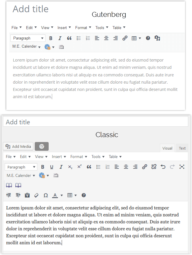
If you are responsible for more than one type of content you may encounter both the new and old editors but, for the type of content you’ll be creating, the differences between the two are cosmetic – all the same elements are present but in different places on the screen. The core editing areas are very similar.
Login to the site
Login to the site in the usual way. A toolbar will appear at the top of the screen

Hover over the society name (1) and click on the Dashboard item that appears (2) to reveal the Author menu:
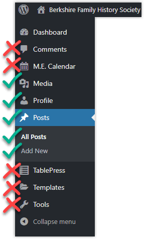 The Author role grants you access to several areas that are of no direct relevance to your content creation role. The Go / No go areas are indicated in the image. Please respect operational boundaries and keep out of the areas marked with a red cross.
We are investigating the feasibility of additional plugins to give us greater control over user roles.
NOTE
The example in this section is based on creating News content. If you are entering another type of content, or have additional privileges such as Event Manager the left-hand panel of the dashboard may vary from what’s shown here.
Dashboard options
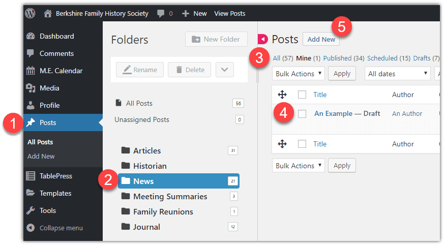
 All items are created as Posts. Clicking this will reveal a set of folders that are used to group posts by content type
 Click on the News folder to filter the list of posts I have created an example post
 The items in this row are quick filters that will display only the specified items. In this screenshot, it’s currently set to Mine. Note: You will be able to see and view posts created by others but you will not be able to edit them
 To open an existing post for editing, click the title. If you hover over the post title an extra menu will appear

The first and third options are self-explanatory. Quick Edit is an option that allows you to edit the post’s metadata without opening the content. Metadata is covered in the sections of the guide that follow this one.
 Create a new post with this option. A new window will open. The format of that window will depend on whether your content type uses the new or old editor. Please move on to the relevant section.
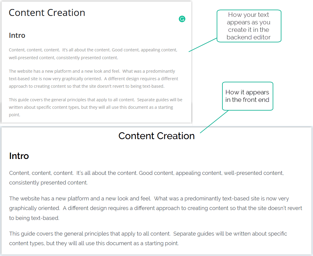
The layout and font that you see in the backend editor are not what the finished product will look like in the front end. The WordPress theme will apply styling to the base content to produce the finished article and the theme only applies to the frontend (see image below for the before-and-after effect.) Therefore it’s a good idea to Preview the post from time to time to check it meets the need.
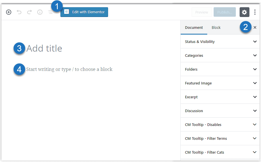
 Please ignore the Edit with Elementor button. You need specialist skills to use Elementor, and for most user-definable content it’s overkill.
 This is the metadata panel. We’ll cover this in the next section.
 Enter a title for your post. It will be prominent throughout the site – it’s the headline for your item, so choose it with that purpose in mind – it needs to sell whatever your content is
 Click here and a text editing window will open

 This row of dropdown menus can be ignored. Most of what you need can be found on the next toolbar
 These are the text formatting tools, and most are self-explanatory. The paragraph dropdown will reveal the Heading styles. The double quote mark is not found in Word/Google Docs so you may not be familiar with it. It’s used to call out references to other parts of the text, or an external source. It applies a special style, usually a different font size, emphasis and indent – depending on the WordPress theme.
 This is the button for adding images to a post
 One of the downsides of editing content in a web browser is the quality of spell checkers. This icon indicates the user has installed the free Grammarly extension in their browser. As the name implies, Grammarly is much more than a spell checker. I recommend it.
 As you build your post you should remember to save it periodically. WordPress does take autosaves every few minutes, but it’s better to get into the habit of committing your work to a full save.
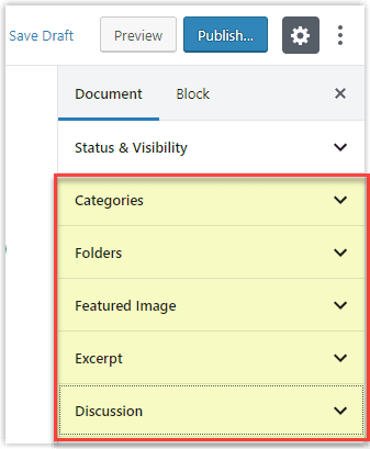 Before your news item can be published it needs metadata adding to it. Metadata is non-visible (usually) data that affects the way the item is published, pushing it to the correct pages and storing it in the correct places.
There are five important pieces of metadata that you need to get right for each post (highlighted in the image.)
There are many other pieces of metadata than shown here. I have removed the unnecessary ones from the list and you might want to do likewise. It will make it easier to remember which ones are important.
Removing Unnecessary Metadata Items
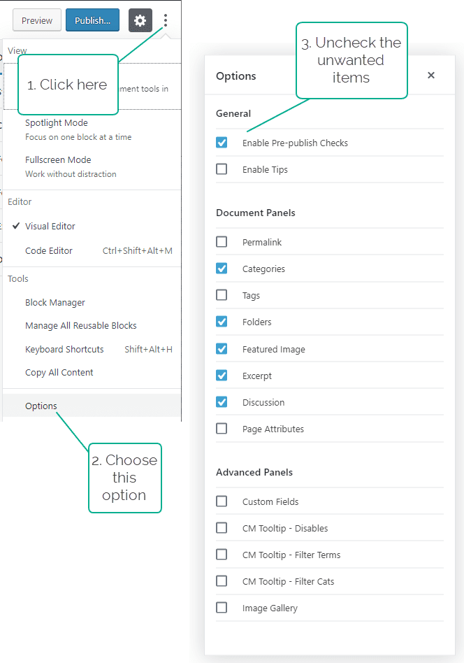
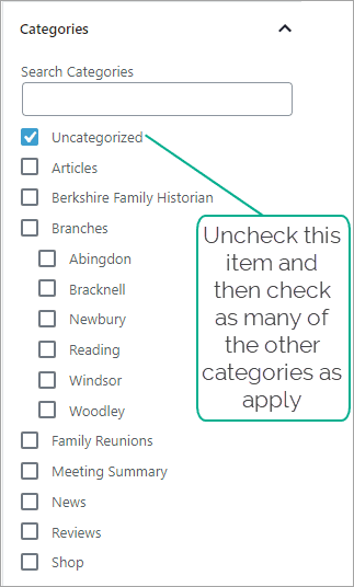 Categories ensure that posts are published to the correct pages in the website. For example, applying the News category will ensure that the post appears on the News page and in the News carousel on the home page.
By default, new posts will be assigned to Uncategorized. You need to uncheck that option and check the appropriate category instead. Some items may belong to multiple categories. Check as many as apply. Details of which category(ies) to use are given in the content-specific guides below.
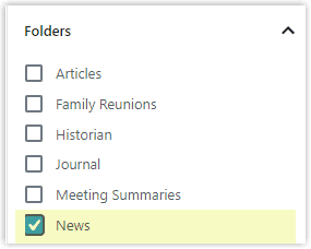 The number of posts stored in the system will be in the hundreds and, as the number grows, it becomes difficult to find them in the repository and understand their relevance to each other.
Assign the item to the correct folder so that it can be found easily. e.g. in this example the post is a News item
Featured Images boost the appeal of an item by attracting search engines, so it is important that one is supplied for every post.
Each content type may have specific size requirements so that the image fits the screen design for that content type that the end users will see.
You must source a royalty-free image or use one of your own. There are also plenty of existing images to choose from in the site’s media library.
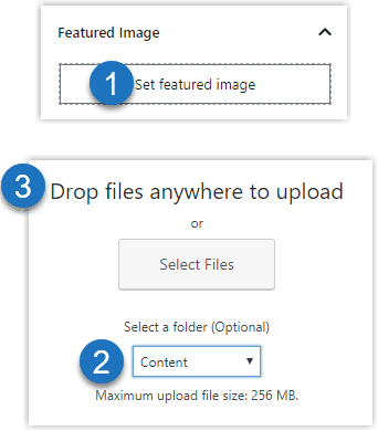
 Click Set Featured Image
 Make sure you adjust this selector to read Content.
 You can either drag-and-drop an image or select a file from your computer to upload
Alternatively, you can search the media library for an existing image
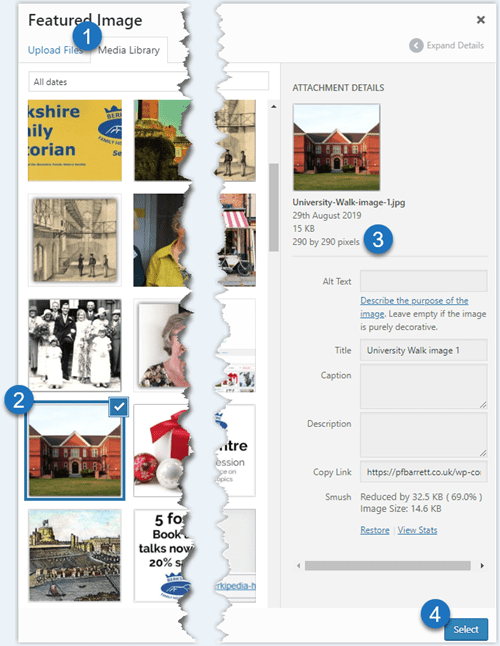
 Select the media library tab
 Find a suitable image
 Check the size matches the requirements set out in the guide for the specific content type you’re creating
 Press Select to insert the image
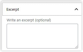 Excerpts are referred to on the WordPress screens as optional. They are in that you can create a post without an one – the system will not stop you. But excerpts have an important role in promoting our site to the internet search engines and are therefore mandatory.
They appear in various pages on our site as the summary of what the post is about. Search engines seek them out because they represent an important source of indexable content.
Excerpts need to be handcrafted. They should be a précis of the post’s salient points – the post’s opening paragraph may be a good source. There is a lot of debate about the ideal length for an excerpt. The WordPress default is 55 words but there is no hard and fast rule – anything up to 100 is fine – but no more.
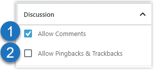
 You need to decide whether an item you post should be allowed to attract comments. By default, comments are not allowed. If you allow them by checking this box, they can only be made by registered users (current memers) who are logged.
The comment will be queued for moderation before being posted so that inappropriate comments can be deleted. When a user has had one comment approved, subsequent comments from that user will be published immediately, without being queued for moderation.
 Pingbacks and trackbacks are mechanisms to allow us to cross-refer to other sites, and they to us in a mutual quoting exercise. This is defaulted to off, and should be left that way because they are a spam magnet
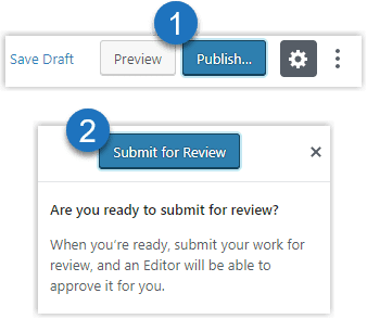
 When you are satisfied with the text and all the metadata has been provided, you can start the publishing process.
 Initially, all new authors’ content will need to be reviewed by the site admin for style, content and completeness (e.g. style guide has been followed and all metadata is present and correct.) The new site has a very different design philosophy to the old and we need to make sure that everyone has adapted to the new style
Authors with a proven track record will be granted permission to self-publish directly without the review step, in which case, Step 1 will immediately publish the item and it will appear on the site.
Content to follow
Content-specific instructions
- News Items
- General articles
- Historian articles
- Meeting summaries
- Product Reviews
- New shop products
- Events Programme
Editor
New style editor
Folder
News
Anything that merits being in another category as well as News should be created in the primary category’s folder and in line with the requirements of that content type, not as News
Category to be assigned
News
An item that is primarily News and is, therefore, being placed in the News folder, is unlikely to need to be added to other categories.
Discussion
In view of the random nature of News topics it’s impossible to make a global statement on whether comments should be allowed. You will need to make a judgement call on a case-by-case basis
Featured Image
All content types benefit from having a featured image but News is an exception. Small News items such as the closure of the Centre on public holidays can probably go without, although a picture of an Easter egg or Chritsmas tree won’t harm.
Size
Unlike other content types, News has no fixed image size requirements. However, the News Page displays the images 300px wide with no height restriction, so images that are less than 300px wide will be resized up, which could cause graininess. Over sized images will be resized down – if you use an existing image from outside the News folder in the media library do NOT resize it down manually – doing so will affect the way that image is displayed in other places.
Framing
Do not add any border to the image. The News Page style will add a shadowed border to every image so a hard border is not required. This is to keep it consistent with the site style.
Editor
Folder
To follow
Category to be assigned
To follow
Discussion
To follow
Featured Image
To follow
Size
To follow
Framing
Editor
Folder
To follow
Category to be assigned
To follow
Discussion
To follow
Featured Image
To follow
Size
To follow
Framing
Editor
Folder
To follow
Category to be assigned
To follow
Discussion
To follow
Featured Image
To follow
Size
To follow
Framing
Editor
Folder
To follow
Category to be assigned
To follow
Discussion
To follow
Featured Image
To follow
Size
To follow
Framing
Editor
Folder
To follow
Category to be assigned
To follow
Discussion
To follow
Featured Image
To follow
Size
To follow
Framing
Events are a specialised topic and are therefore dealt with in a separate help section. Click here
